
Teams
- UX designer (2)
- Program manager
- Client manager
Overview
In 2020, I worked on Schneider's mobile app redesign while at Hugo & Cat, partnering closely with another designer to modernize the experience for drivers and fleet managers. The work focused on improving clarity across everyday logistics workflows, creating a more consistent interface system, and helping the product feel more intuitive in moments that needed speed and confidence.
Rather than treating the redesign as a purely visual refresh, we approached it as a usability problem. The app needed to support people who were often working in motion, under time pressure, and inside operationally dense flows. That meant the UI had to do more than look clean. It had to reduce friction, surface the right information quickly, and create a rhythm that made repeated tasks easier to complete.
The Challenge
Schneider’s mobile product supported a complex set of logistics needs, which meant even small interface decisions carried weight. The challenge was to make the experience easier to navigate without stripping away the density that power users relied on. We needed to bring greater structure to the product, improve readability, and build a system that could scale more gracefully across screens and flows.
Because the audience included drivers and fleet-facing users, the interface had to support quick comprehension. Navigation, hierarchy, spacing, status communication, and visual consistency were not decorative concerns. They were central to how the product performed in real use.
My Contribution
My role centered on UI design: shaping the visual system, refining screen-level layouts, and helping translate product and UX decisions into an interface that felt cohesive and usable. Working alongside another designer at Hugo & Cat, I contributed to the redesign of key mobile flows and helped establish a more modern, consistent foundation for the app.
The work included:
- designing and refining core mobile screens
- improving hierarchy and readability across dense information layouts
- developing a more consistent visual language across flows
- supporting onboarding and login moments with clearer structure
- using illustration and interface tone to make the product feel more approachable
Home Feed
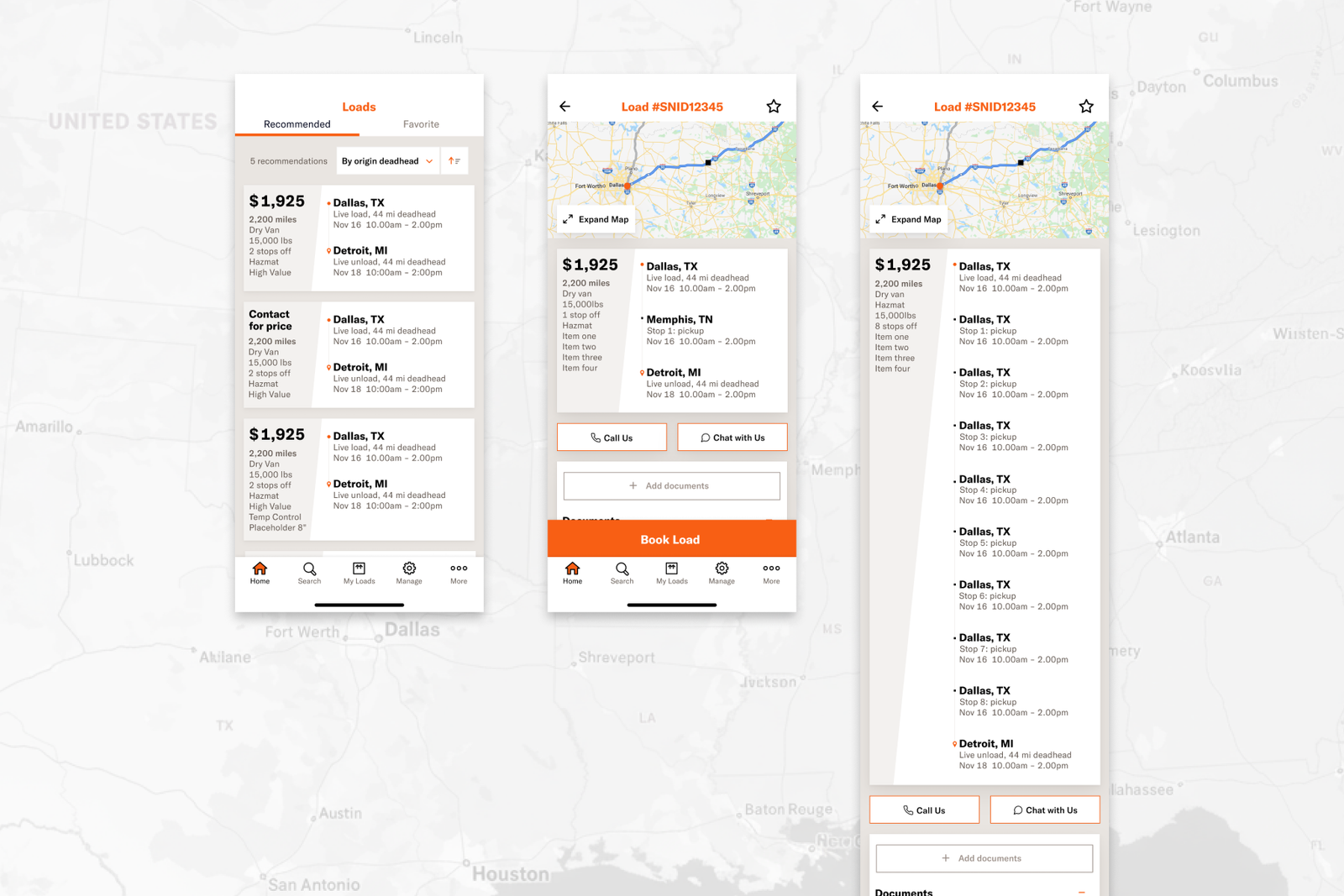
One important part of the redesign was the home feed experience. This is where clarity matters most because it sets the tone for everything that follows. We focused on making information easier to scan, reducing visual ambiguity, and structuring the screen so users could quickly understand what required action.
The design direction emphasized cleaner hierarchy, stronger grouping, and a more deliberate balance between utility and calm. The result was an interface that felt more ordered and easier to work through.
llustrations and Product Tone
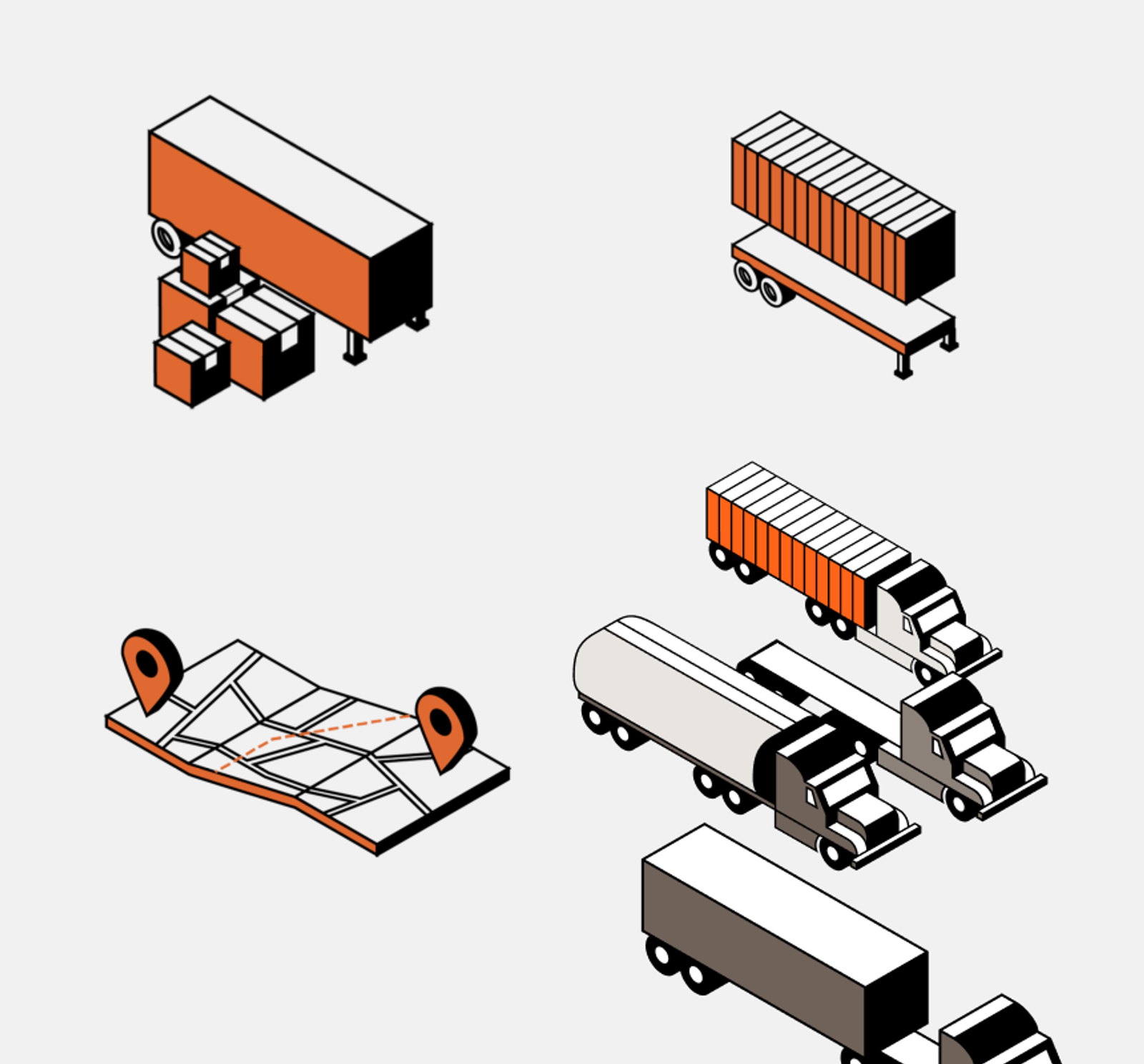
Another part of the project involved visual language beyond standard UI components. The illustrations helped soften the experience and introduced moments of warmth into a workflow-heavy product. In a logistics context, that kind of tone work can matter more than it first appears. It helps the product feel less mechanical and more intentionally designed for the people using it every day.
These supporting visuals gave the interface a friendlier character without getting in the way of function.
Login Flow
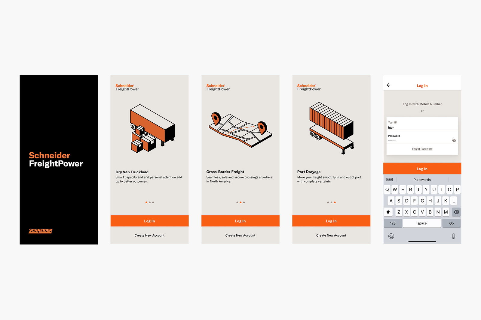
The login flow was another key area of attention. Entry points into enterprise tools are often overlooked, but they shape first impressions and set expectations for the rest of the product. We worked to make this flow feel cleaner, more modern, and easier to move through, with a stronger sense of polish and consistency.
By simplifying the presentation and tightening the visual system, the flow felt more trustworthy and less cumbersome.
Search and Findability
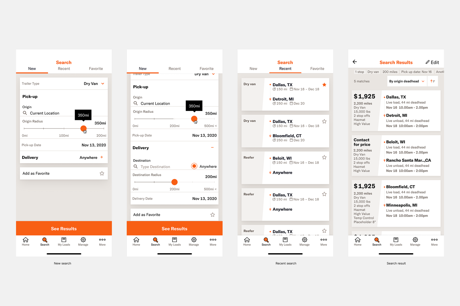
Search is one of those features that reveals whether a product truly respects a user’s time. In this redesign, the search experience needed to feel direct and legible, especially for users trying to find the right information quickly in the middle of operational tasks.
The visual design work here focused on reducing friction, clarifying inputs and results, and making the overall interaction feel more dependable. Even when the feature itself is straightforward, confidence comes from the details.
Working as a Design Partner
What made this project meaningful was the collaboration. This was not solo authorship. It was shared design work, developed in partnership with another designer and supported by a broader team that included program and client management. That collaborative structure helped us move between product needs, stakeholder expectations, and execution details without losing sight of the user experience.
For me, the project reinforced how much strong UI design contributes to enterprise products. When the underlying workflows are complex, visual design becomes part of the product strategy. It helps users move faster, understand more, and trust the system more deeply.
Reflection
The Schneider redesign was a chance to bring clarity and modern craft to a utilitarian product space. It showed how thoughtful UI design can improve not just how a product looks, but how it works in practice for the people who depend on it.
Looking back, the work stands out as an example of designing for usefulness without sacrificing visual quality. It was about making a demanding product feel more coherent, more approachable, and more capable in everyday use.