
Training my design taste, one interaction at a time
I’ve been revisiting the small interactions in Sparkquest. The goal is to train my eye: notice what feels off, make a change, and look again.
A screen tells you part of the story. The rest happens when you use it. You select a tab, something changes, and in that brief moment you feel how much care went into the product.
I wanted to pay closer attention to those moments. Sparkquest gave me somewhere concrete to practice, with interactions I could refine and compare directly.
I focused on four interactions, with a simple goal: make state changes clearer and keep feedback from disrupting the page. The changes are small enough to miss in a screenshot. The before-and-after clips make them easier to see.
Selecting a tab in Parent settings
Children, Tasks, and Rewards now share one background indicator that slides between the tabs. Keeping the selected state connected as it moves gives the interaction a sense of continuity.
The indicator moves horizontally over 160 ms, with a curve that gives it a soft start and finish. Equal-width grid columns keep its size consistent. Base UI provides the selected tab’s position, and a CSS transform handles the movement.
The content switches immediately. If I select another tab while the indicator is moving, the transition redirects toward the new selection. Keyboard navigation and reduced-motion selections skip the slide. I wanted the motion to clarify the change without making anyone wait for it.
Adding a redemption to history
A newly saved redemption now fades into the history and lifts into place by just 4 px. The transition takes 180 ms with ease-out. Only the new row moves; the existing history stays still, so the change has a clear point of focus.
The timing took more care than the movement itself. In the first implementation, the row appeared, disappeared, then animated back in. That visible–hidden–visible flash made the addition feel unsettled. I changed the sequence so the row starts hidden on its first render and begins its transition after the confirmation dialog closes.
That small ordering change gives the new row one clean entrance. With reduced motion, it uses a 60 ms fade without the lift. Keyboard confirmation stays immediate.
Opening and dismissing the calendar
The calendar now fades in while scaling from 97% to its full size over 200 ms. It’s a subtle change, but it gives the dialog a more deliberate arrival. Closing reverses the fade and scale over 150 ms. The quicker exit lets the interaction get out of the way once the decision is made.
Both directions use the same custom ease-out curve. Base UI keeps the dialog mounted until the exit finishes, so it doesn’t disappear halfway through the animation. It also manages focus trapping while the dialog is open and restores focus when it closes.
For reduced motion, only a 60 ms fade remains. Opening and dismissing with the keyboard are immediate. These details matter as much to me as the animation itself: the calendar should feel considered through each way someone uses it.
Adding a new task item
The previous success banner pushed the form and task list downward. Adding one task changed the position of the page I was working in. I replaced the banner with a Sonner success toast, fixed at the bottom right and outside the document flow. The confirmation arrives while the form and list hold their positions.
I kept Sonner’s built-in slide-and-fade motion and matched the toast to Sparkquest: Geist at 14 px, a 12 px corner radius, and the app’s surface, text, and border colors. The feedback should feel like part of the app.
The toast appears only after saving and refreshing succeed. It can be dismissed and uses polite screen-reader announcements. Focus returns to the task-name field, ready for the next entry. The refinement is as much about continuing the task as it is about confirming the last one.
The timing between the details
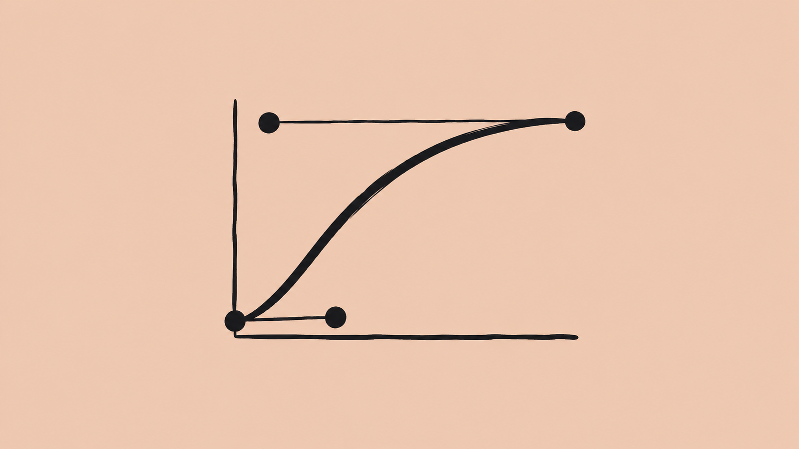
I used two custom easing curves across these refinements. The calendar and redemption transitions use an ease-out curve; the tab indicator uses an ease-in-out curve for its softer start and finish.
/* Calendar and redemption entrances/exits */
--ease-out: cubic-bezier(0.23, 1, 0.32, 1);

/* Selected tab moving between positions */
--ease-in-out: cubic-bezier(0.77, 0, 0.175, 1);
The numbers only describe part of the result. A history row entering before its dialog closes, or a notification moving the form beneath it, can make a short animation feel awkward. I had to look at the sequence of events, where focus went next, and what stayed still.
Learning to notice
I think taste develops through this kind of repetition. Make a decision, see it in motion, then ask whether it feels right. A working interaction gives me a starting point. Paying attention to the details gives me something to improve.
Those details also have to survive the build. When designing and building are separate roles, timing, focus behavior, and small transitions can get lost in the handoff. I’ve found it valuable to work with the interactive UI myself: build it, use it, and check whether the experience carries through what I intended as a designer.
As it becomes easier to turn an idea into a working interface, I think training our eyes matters more than ever. I want to spend more time studying products and websites like Vercel and Linear, trying their interactions myself, and asking why they feel the way they do. Then I can experiment in my own work and judge the result in use.
That’s what I’m practicing here: slowing down enough to see the small things, and caring enough to revisit them.
If you’d like to feel these changes for yourself, visit Sparkquest and try the demo. Switch between the Parent settings tabs, open the calendar, add a task, and add a redemption to history. The clips show the difference; using the interface lets you judge how it feels.