
Design Foundations, Part 1: Typography Is How an Interface Speaks
A screen can have all the right information and still feel hard to use. Sometimes the issue isn't the flow. It's that everything is shouting at the same volume.
Typography is how we give words shape, hierarchy, and rhythm. In an interface, it's also how people find the thing they need, understand what matters, and know what to do next.
We get type almost for free now. Pick a font, pick a size, done. I think that's exactly why it's worth slowing down. People used to put an enormous amount of effort into every line of type, and the reasons they cared haven't gone anywhere.
Before we dive into how we put care into typography, let's take a look at how typesetting was done in the old days and how that process shaped today's typography. Not for nostalgia. It explains three things: why typographers obsess over details most people never notice, where everyday words like leading and lower case come from, and what we risk losing now that setting type takes no effort at all.
When type had weight
Movable type is a simple idea. Instead of carving a whole page into one piece of wood, you make every character as its own small piece. You arrange the pieces into lines and pages, print, then take them apart and reuse them for the next job. Before that, printing in China was done from woodblocks: a carver cut an entire page by hand, and the block could only ever print that one page.
The first movable type we know of was made by Bi Sheng in Song dynasty China, sometime between 1039 and 1048. He cut each character into soft clay, about as thin as the edge of a coin, and baked the pieces hard. To print, he set the characters close together inside an iron frame on an iron plate coated with pine resin, wax and paper ash. He warmed it until that paste softened, pressed a flat board across the type so every face sat level, and let it cool into one solid block. He kept two plates going, setting one while the other printed. We only know this because the scholar Shen Kuo wrote it down in his Dream Pool Essays.
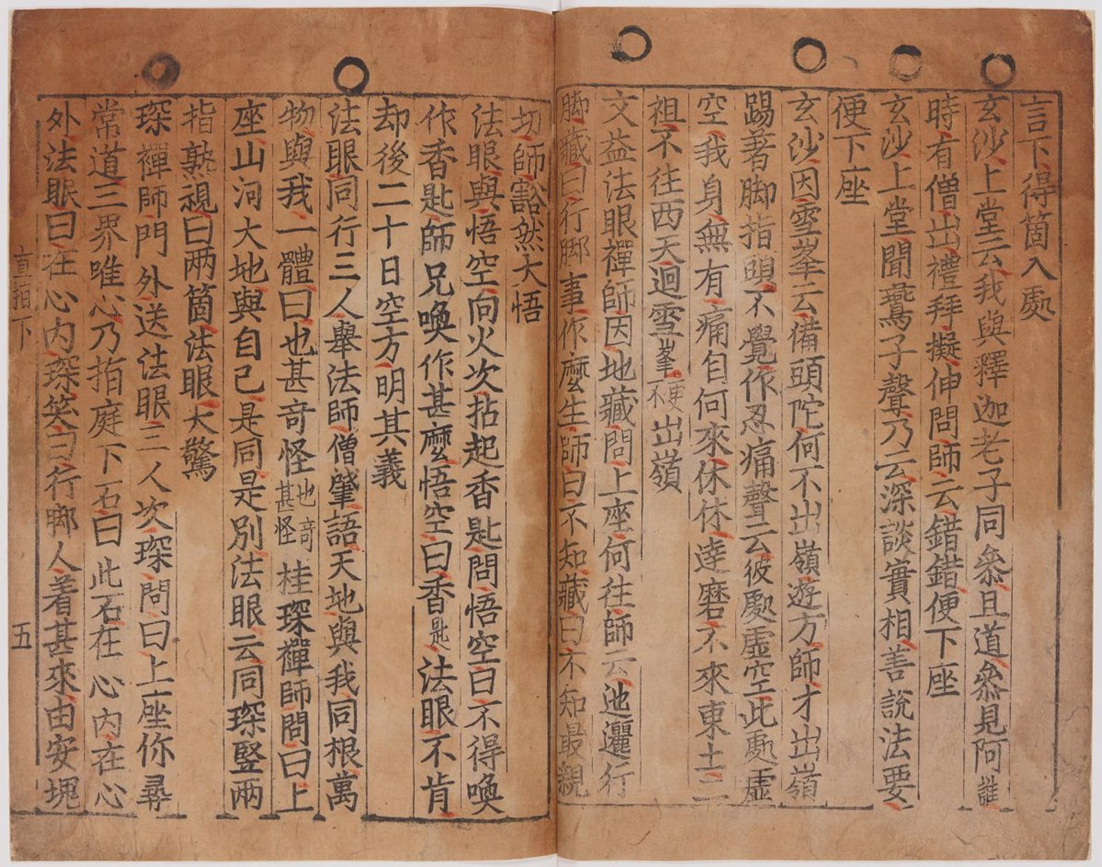
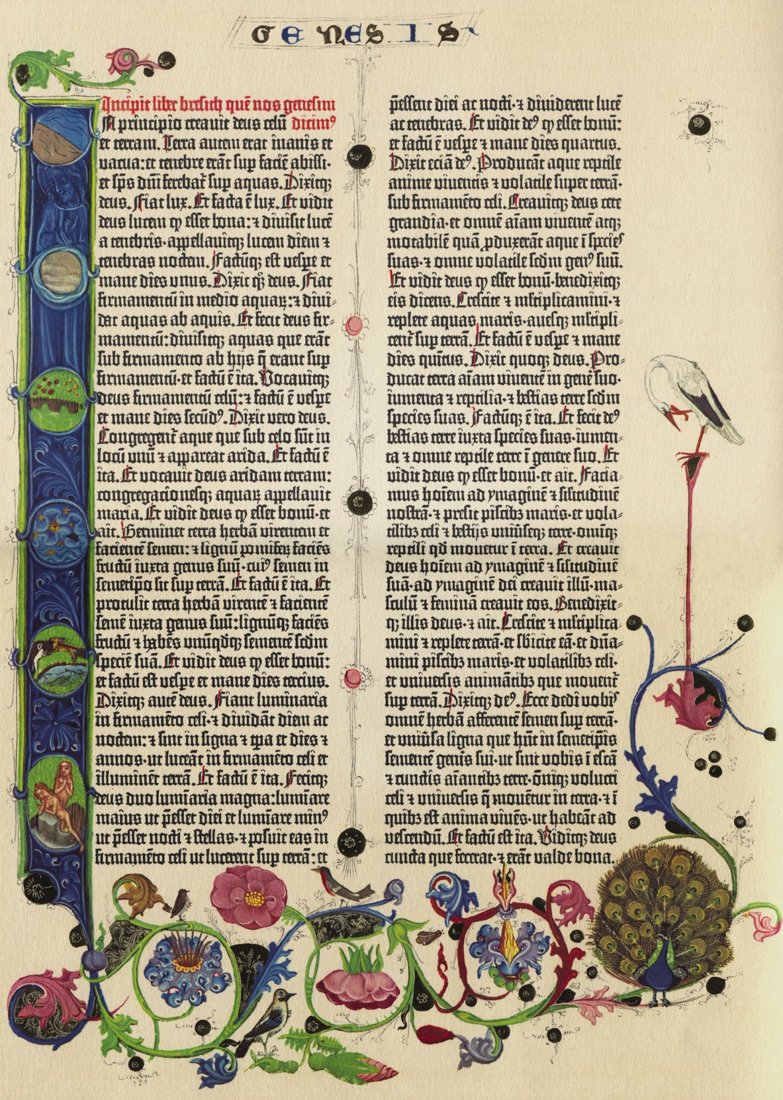
Metal came later. Jikji, a Korean Buddhist text printed in 1377, is the oldest surviving book printed with movable metal type, 78 years before Gutenberg's 42-line Bible was printed between 1452 and 1455. In Europe, the craft that grew out of Gutenberg's press stayed manual for centuries: a person, a case full of tiny metal letters, and a lot of patience.
A compositor held a composing stick in one hand and picked letters, called sorts, out of the type case with the other. Each letter was cast in reverse and set upside down, and the compositor found the right orientation by feeling for a small groove on the metal called the nick. When a line was nearly full, they filled the gaps between words with spacing material until it fit the measure exactly. That's justification, done by hand, one line at a time.
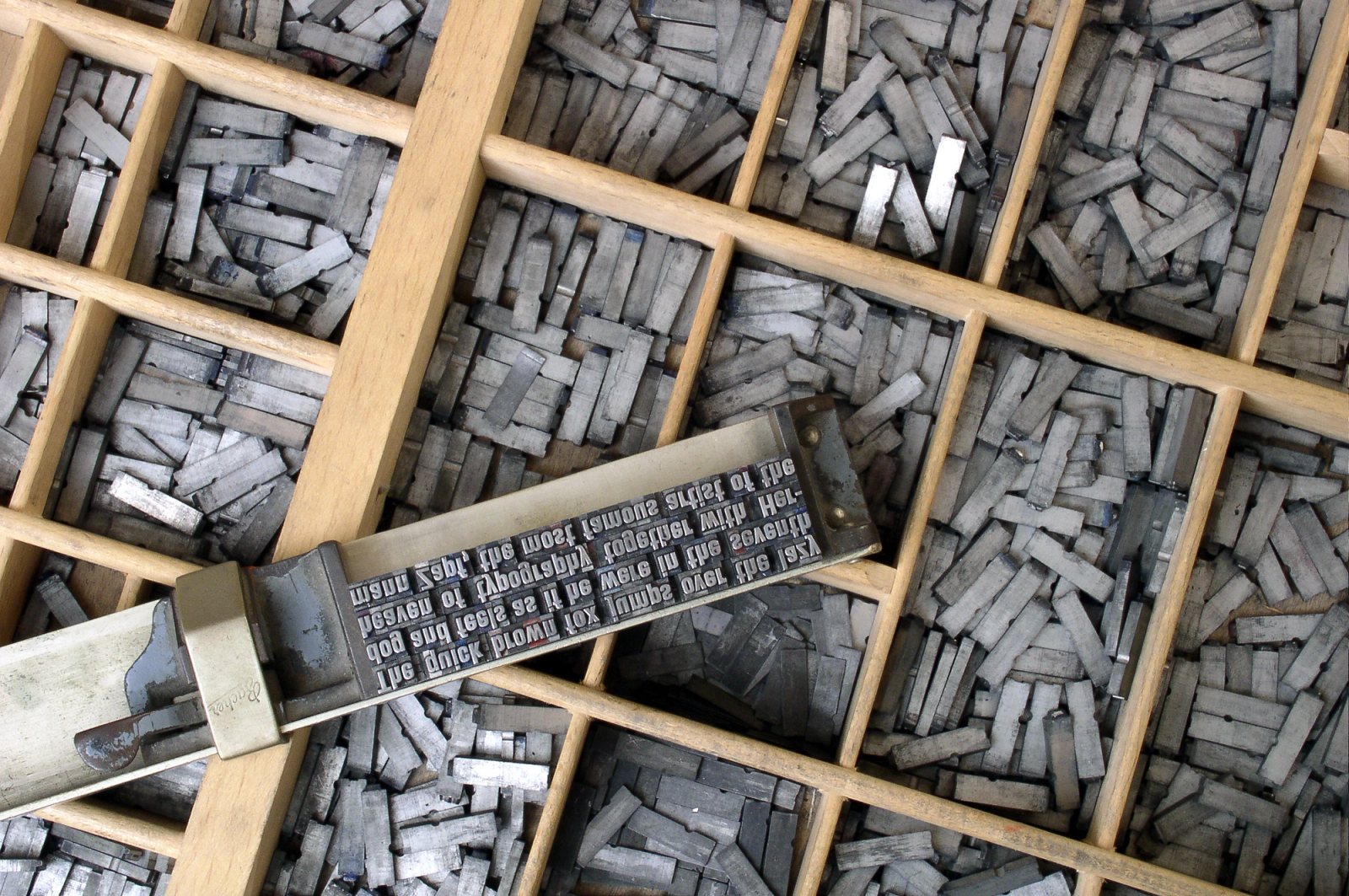
Some of our everyday vocabulary comes straight from that workbench:
- Leading: literally strips of lead placed between lines of type to open them up. Peter Schoeffer is credited with being the first to use them, around 1465.
- Lower case: the case closest to the compositor, which held the letters used most. Capitals lived in the upper case, further back.
And once the job was printed, every letter went back into its compartment by hand, ready for the next one. Nobody added a word, a space, or a line of air casually. Every decision on the page had a physical cost, so people made those decisions on purpose.
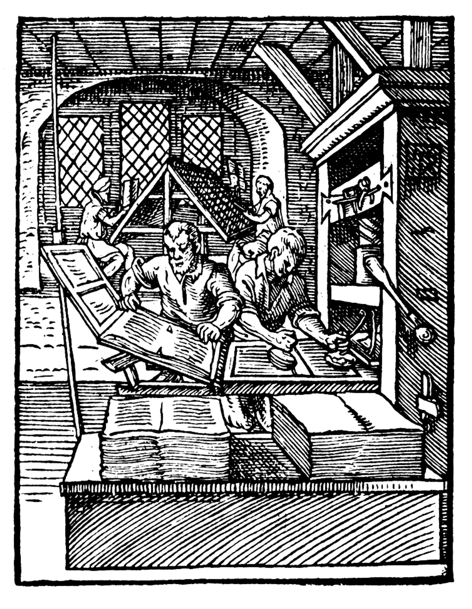
Typing is free. Caring isn't.
Today the cost is close to zero. We switch typefaces with a click, nudge letter spacing with a slider, and an AI tool can now generate a whole screen of text in seconds. That's genuinely great. I don't miss picking lead out of a drawer.
But the effort used to force attention, and when the effort disappears, the attention tends to go with it. Readers still feel the difference between a page someone set with care and a page that was just filled. They probably can't name it. They just read less, scan worse, or trust the thing a little less.
Vignelli and the case for fewer typefaces
Massimo Vignelli, whose firm Unimark redesigned the New York subway's signage, was famously strict about type. In the new computer age, he wrote, “the proliferation of typefaces and type manipulations represents a new level of visual pollution threatening our culture.” Even more bluntly: “Out of thousands of typefaces, all we need are a few basic ones, and trash the rest.”
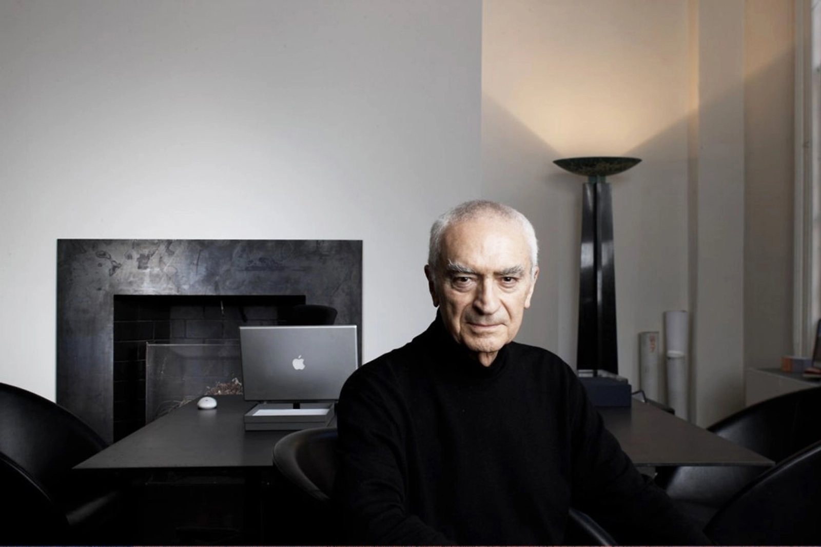
His own list was short. In The Vignelli Canon, he describes working with only four typefaces: Garamond, Bodoni, Century Expanded, and Helvetica. He allows a few more, like Futura, Optima, Univers, Caslon, and Baskerville, and that's about it. In his words: “Personally, I can get along well with a half a dozen, to which I can add another half a dozen, but probably no more.”
Helvetica was the sans serif he kept coming back to, and it has a good origin story of its own. Max Miedinger and Eduard Hoffmann at the Haas type foundry in Switzerland released it in 1957 as Neue Haas Grotesk, and it was renamed Helvetica, from the Latin word for Switzerland, in 1960. When Unimark worked on the subway, Vignelli wanted Helvetica. The 1970 manual actually specified Standard Medium, also known as Akzidenz-Grotesk, likely because Helvetica would have cost the in-house sign shop too much time and money. Paul Shaw, who wrote a whole book on the subject, traces how Helvetica only became the official systemwide typeface in 1989. Even an obsession has to deal with production reality.

What I take from Vignelli isn't the exact list. Michael Bierut, who worked for him for a decade, once wrote: “Sometimes I think that Massimo Vignelli may be using too many typefaces, not too few.” It's the discipline. Vignelli knew a few faces so deeply that he could make them say almost anything. From my experience, that kind of depth beats scrolling through a font library hoping the next one will fix the layout. A typeface rarely fixes a layout.
So why are there so many typefaces?
If a dozen is enough, why do foundries and independent designers keep making new ones? Because type isn't neutral. The same sentence set in two faces can sound like two different people. Here's what actually separates one typeface from another:
- Voice and emotion: a high-contrast Didone feels formal and fashionable, a rounded sans feels friendly, a slab feels sturdy. The shapes set a tone before anyone reads a word.
- Legibility: how easily individual letters can be told apart. Think 1, l, and I, or rn and m.
- Readability: how comfortable it is to read a lot of text. A perfectly legible face can still be tiring after five paragraphs.
- Size: some faces are drawn to shine big, others to survive small. That's why many families now come in optical sizes.
- Texture and rhythm: squint at a paragraph. Some faces make an even gray, others sparkle, others feel heavy.
- Cultural associations: blackletter reads as old world, a geometric sans as early modernist. Readers bring that baggage whether you want them to or not.
- Language support: accents, Cyrillic, Greek, Hangul. In a multilingual product, the Latin letters are only part of the decision, and matching a Latin face with a Hangul one is a craft of its own.
- Technical performance: screen rendering, file size, variable fonts that pack a range of weights into one file, and features like tabular figures.
- Licensing: whether you can actually use it on the web, in an app, or in a logo. Boring, but it ends a lot of font crushes.
A quick look at the anatomy
To talk about those differences precisely, a few parts of a letter are worth knowing, even if you're not designing a typeface:
- Baseline: the invisible line most letters sit on.
- x-height: the height of lowercase letters such as x, excluding ascenders and descenders. A generous x-height can make small text feel larger, though it isn't a guarantee of readability.
- Ascenders and descenders: the parts that rise above the lowercase body, like the stem of h, or drop below the baseline, like the tail of p.
- Counter: the enclosed or partly enclosed space inside a letter, as in o or e. At small sizes, tight counters can start to close up.
- Aperture: the opening in letters like c and e. Open apertures can help distinguish shapes when the text is small.
- Stroke and terminal: the lines that build a letter and the way those lines end. A terminal might end bluntly, curve, or finish in a ball.
- Serif: a finishing stroke attached to the end of a main stroke. Sans serif literally means without serif.
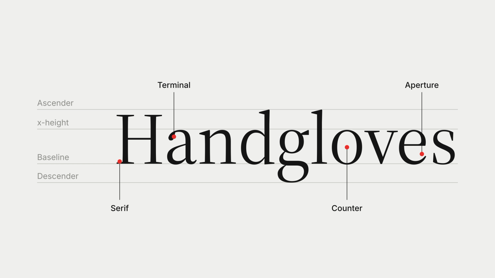
You don't need to memorize every part. The point is to have a way to explain why two fonts feel different. “This one feels clearer” is useful feedback. “The apertures stay open and the numerals are easier to tell apart at 12 pixels” gives you something you can act on.
The serif family isn't one look
Serifs come in many forms. These categories are useful starting points, not airtight boxes:
- Old style, such as Garamond and Caslon, often has relatively gentle stroke contrast and a calligraphic feel.
- Transitional, such as Baskerville, tends toward sharper detail and more contrast between thick and thin strokes.
- Modern or Didone, such as Bodoni and Didot, is known for dramatic stroke contrast and fine, often unbracketed serifs. It can be striking at display sizes; those delicate details deserve a close look at smaller sizes.
- Slab serif, such as Rockwell, uses substantial, block-like serifs. It can feel sturdy or energetic, depending on the design.
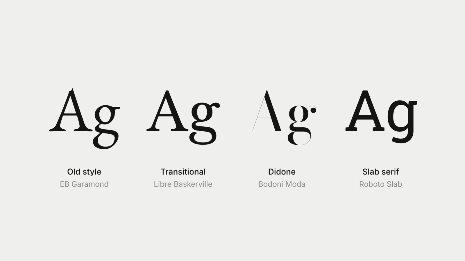
Sans serifs have variety too: a humanist face can feel open and warm, while a geometric one may feel more constructed. Neither serif nor sans serif is automatically more readable in every situation. Size, rendering, spacing, content, and the particular typeface all matter.
Display faces and text faces have different jobs
Some typefaces are made to be looked at. Others are made to be read through. A lot of the type trouble I see comes from mixing up the two.
Display and decorative faces are built for size. They can afford high stroke contrast, delicate hairlines, tight spacing, unusual shapes, and a lot of personality, because at 60 pixels the eye has room to enjoy all of it. Shrink one down to a paragraph and the hairlines break up, the tight spacing clogs, and the personality turns into noise.
Text and UI faces are built to get out of the way. They usually share a few traits:
- A generous x-height, so small text holds up.
- Open apertures and clear counters, so letters stay distinct.
- Moderate stroke contrast, so thin parts don't vanish on screen.
- Slightly looser spacing than a display face.
- Unambiguous characters and practical features like tabular figures for labels, data, and forms.
UI type carries an extra burden. It has to work at 12 pixels in a dense table, at 32 in a page title, and everywhere in between, often on screens you'll never see. That's why so many products lean on workhorse sans serifs with lots of weights. They're not exciting on a specimen sheet. That's kind of the point.
One family or a pairing?
Both can be great. They just solve different problems.
A single family is the quiet, disciplined choice. One well-chosen family with useful weights and styles can carry an entire interface, and the hierarchy comes from size, weight, and spacing instead of a second voice. It's easier to maintain, harder to get wrong, and very Vignelli. For most product UI, this is where I'd start.
A pairing earns its place when the content needs two voices. Imagine an editorial product using a distinctive serif for article headlines and a quieter sans serif for navigation and body copy. The contrast helps readers recognize a headline. Compatible proportions and a similar level of formality keep the two from feeling like they came from different products.
A good pairing gives each typeface a job while making them feel like they belong in the same conversation. That often means contrast in role, compatibility in character. In practice, that tends to look like:
- Clear roles: one face leads, the other supports.
- Similar proportions: x-heights, widths, and weights that sit comfortably on the same line.
- A shared skeleton: a humanist sans next to an old style serif often feels natural, because both trace back to the pen.
- Superfamilies: some families ship serif and sans versions designed together, which takes a lot of the guesswork out.
A pairing feels off when both faces are trying to be the star, or when they're so similar that the difference looks accidental. Test it in actual content. A type specimen saying “Hamburgefonts” won't tell you how the combination handles a long error message or a table of dollar amounts.
Either way, the question isn't “Which two fonts look good together?” It's “What jobs does the type need to do?”
Typography in a UI has work to do
Start with hierarchy: page title, section heading, body, label, supporting text. Give each role a clear place in the system. A small set of sizes, weights, and line heights is easier to maintain than a new combination for every component.
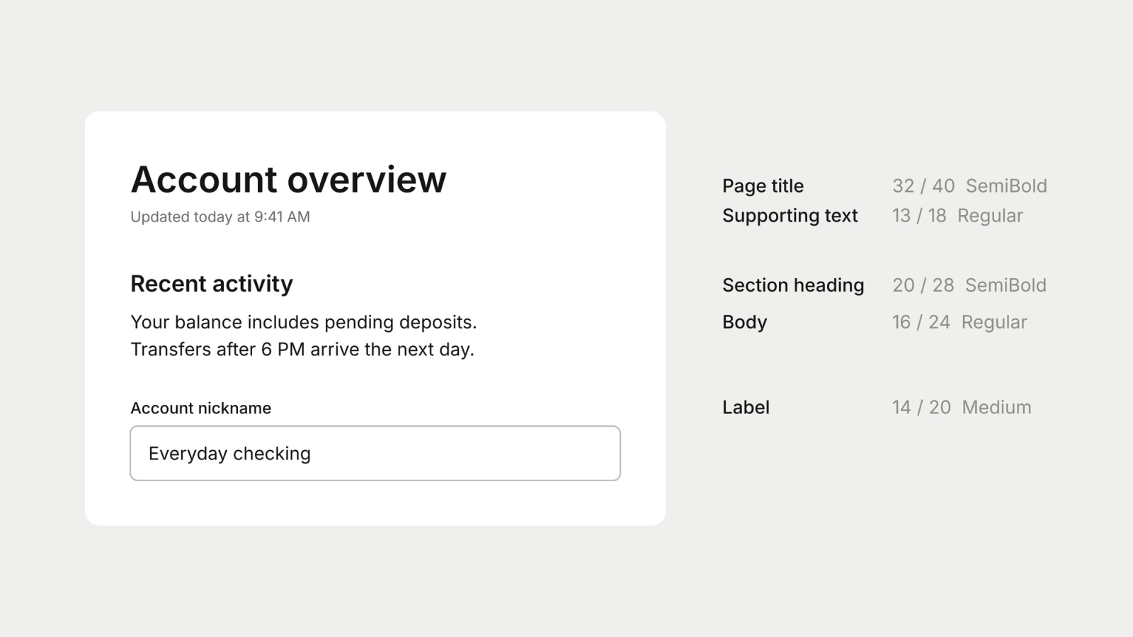
Then check the details where interfaces tend to break:
- Body copy: Give lines enough leading and a comfortable measure. Read a real paragraph, not just one sentence.
- Labels and helper text: Don't make the information people need so small or faint that it disappears.
- Numbers: Compare 1, I, and l; 0 and O. Tabular figures can help columns of amounts line up.
- Dense screens: Increase distinction between roles before adding more weights or colors.
- Real content: Try long names, wrapping buttons, translations, zoom, and narrow screens. A system that only works with placeholder text isn't finished.
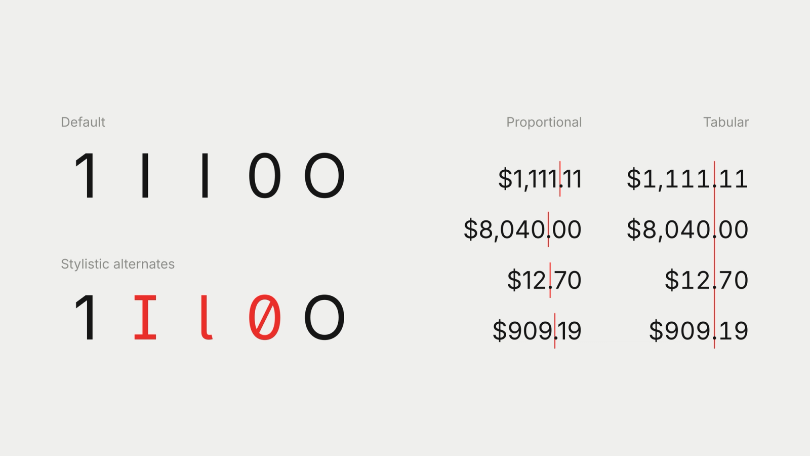
Accessibility matters here too. Text needs sufficient contrast, and a layout should continue to work when people enlarge it. A typeface can't solve those problems on its own.
How I'd pick type for different kinds of work
There's no universal best font, but there are good starting points:
- Product UI and dashboards: a sturdy sans with plenty of weights, tabular figures, and clear numerals. Test it in your densest table first, not on the landing page.
- Long-form reading: a face that stays comfortable over many paragraphs, with generous line height and a measure that doesn't send the eye too far across.
- Marketing and brand moments: this is where a display face gets to shine. Let it lead the headlines, then hand off to something calmer.
- Multilingual products: check script coverage early, and test the languages with the longest words and the tallest characters.
- Data and code: monospace or tabular figures, and characters that can't be mistaken for each other.
A few habits apply no matter what you're making:
- Start from the content, not the font menu. Write down what the type needs to do before you browse.
- Test at real sizes, on real devices, with real text.
- Limit yourself. A couple of families and a small type scale will take you further than you'd think.
- Check the boring stuff early: languages, weights, licensing, performance.
Taste starts with noticing
I think typography is one of the fastest ways to develop a more precise design eye. Look at a screen you like and cover the colors. What still tells you where to look? Which differences are doing useful work? Which are just decoration?
The same questions apply when an AI-generated design lands in front of you. It may look polished at first glance, but can a person scan the information? Do the numbers line up? Are the labels readable? Knowing the anatomy and the principles doesn't produce taste automatically. It gives you a vocabulary for practicing it.
Compositors couldn't avoid caring, because every letter passed through their hands. We can avoid it now, so caring has become a choice. I think it's one worth making. Next time you open a font menu, or accept a screen an AI drafted for you, slow down and look at the letters. They're doing more work than you think.
Next: color, and why a palette needs more than colors that look good next to each other (Coming soon)
Further reading
- Thirteen Ways of Looking at a Typeface — Michael Bierut, Design Observer
- Massimo Vignelli's A Few Basic Typefaces — Fonts In Use
- Review of Paul Shaw's Helvetica and the New York City Subway System — Urban Omnibus
- Gutenberg's inventions: composing stick and hand composition — drupa
- Compositor's tools — Letterpress Commons
- Typography anatomy — Figma
- Font pairing and hierarchy — AIGA